Character select screen update
Kobold Crawler (alpha) » Devlog
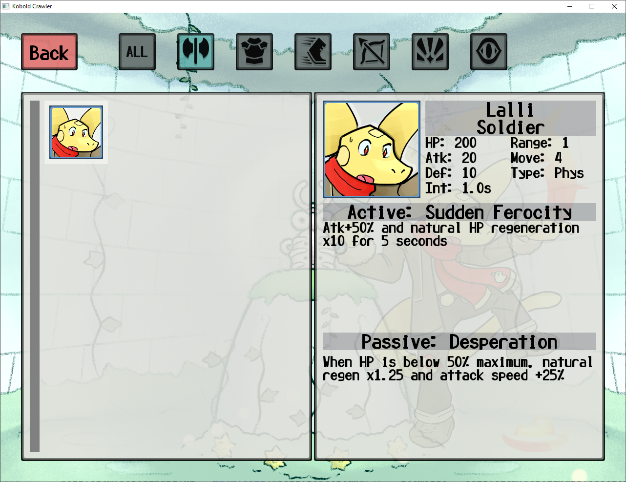
Happy post-Christmas! I spent most of yesterday working on the character select screen, because what better way to spend a holiday in which one is expected to interact with other people:

There's a bunch of very exciting things here:
- There are now filter buttons for the 6 metaclasses along the top of the screen! There is currently exactly 1 class representative in each tab but that will change Soon(tm) and it will eventually be very helpful for grabbing the exact character you want out of the dozens that may be available
- The right pane has been reorganised and has about twice the information on it; I'd like to add a tooltip on the class name which displays its intrinsics when hovered but this will do for now
- The presentation has overall been improved, with borders on character portraits, highlighted headers, and even a faint full-body image of the character in the background of the stat window
- While not visible in this screencap, characters are now always displayed in the same order they are defined in the source code, instead of whichever order they happen to land in memory which would vary between sessions and potentially get very confusing and annoying to sort through if we, say, were to add a significant surplus of characters to sort through
Next I need to write a short plot outline for the main campaign, which might take 10 minutes or might take a week. We shall see!
If this project looks interesting to you, remember to Like this post and follow for more updates!
Get Kobold Crawler (alpha)
Kobold Crawler (alpha)
A tactical dungeon crawling roguelite featuring cute kobolds, currently under construction
| Status | Prototype |
| Author | Mr Frog |
| Genre | Role Playing |
| Tags | 3D, kobolds, Mouse only, permadeath, Roguelite, Singleplayer, Tactical RPG |
More posts
- Demo ReleasedFeb 07, 2025
- First boss all finished!Jan 03, 2025
- Assets for the first boss all done!Dec 09, 2024
- Flu progress: FLUGRESS!!Nov 28, 2024
- First zone (mostly) done! +minimapNov 13, 2024
- Zone 1 Elite Enemies Done!Nov 03, 2024
- Basic Zone 1 Enemies done!Sep 30, 2024
- New UI Look!Sep 04, 2024
- Items all illustrated! Finally!!Aug 19, 2024
- Quick status update: Items all implemented!May 08, 2024
Leave a comment
Log in with itch.io to leave a comment.